

Sarah Bradshaw approaches every wedding the same way she approaches editorial work — with a defined visual concept, a curated color palette, and intentional creative direction from start to finish. This Color Theory series was born from that same instinct.
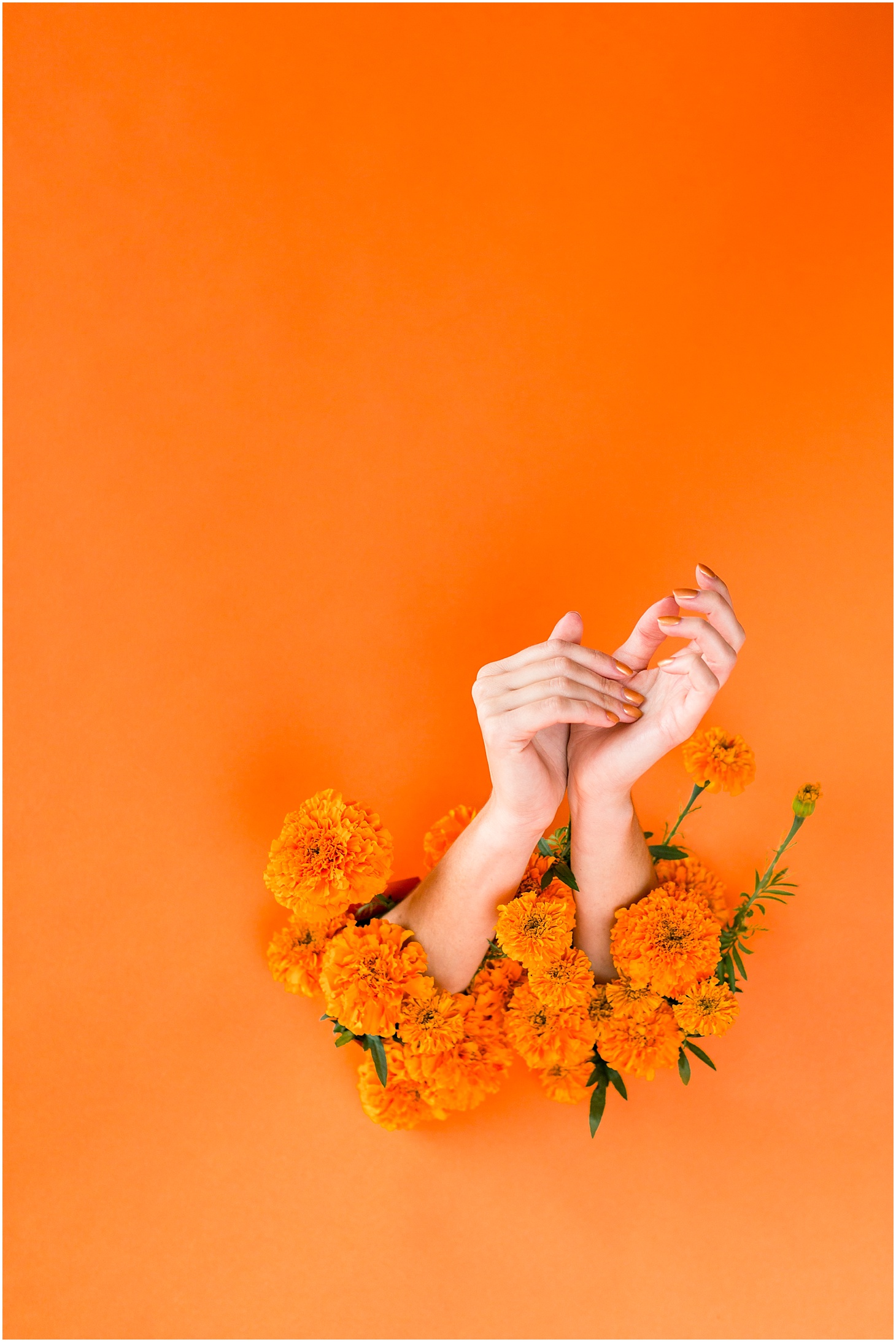
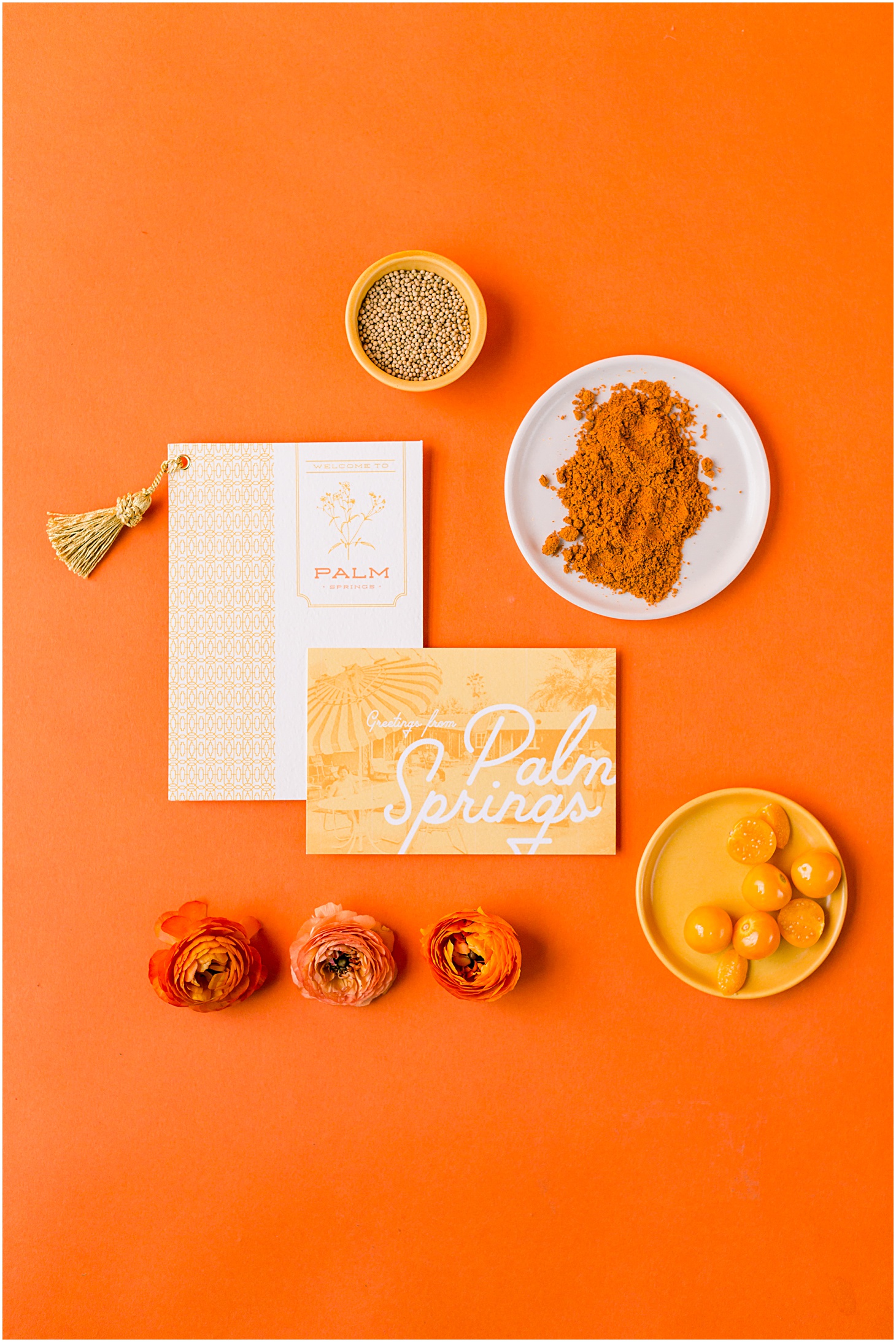
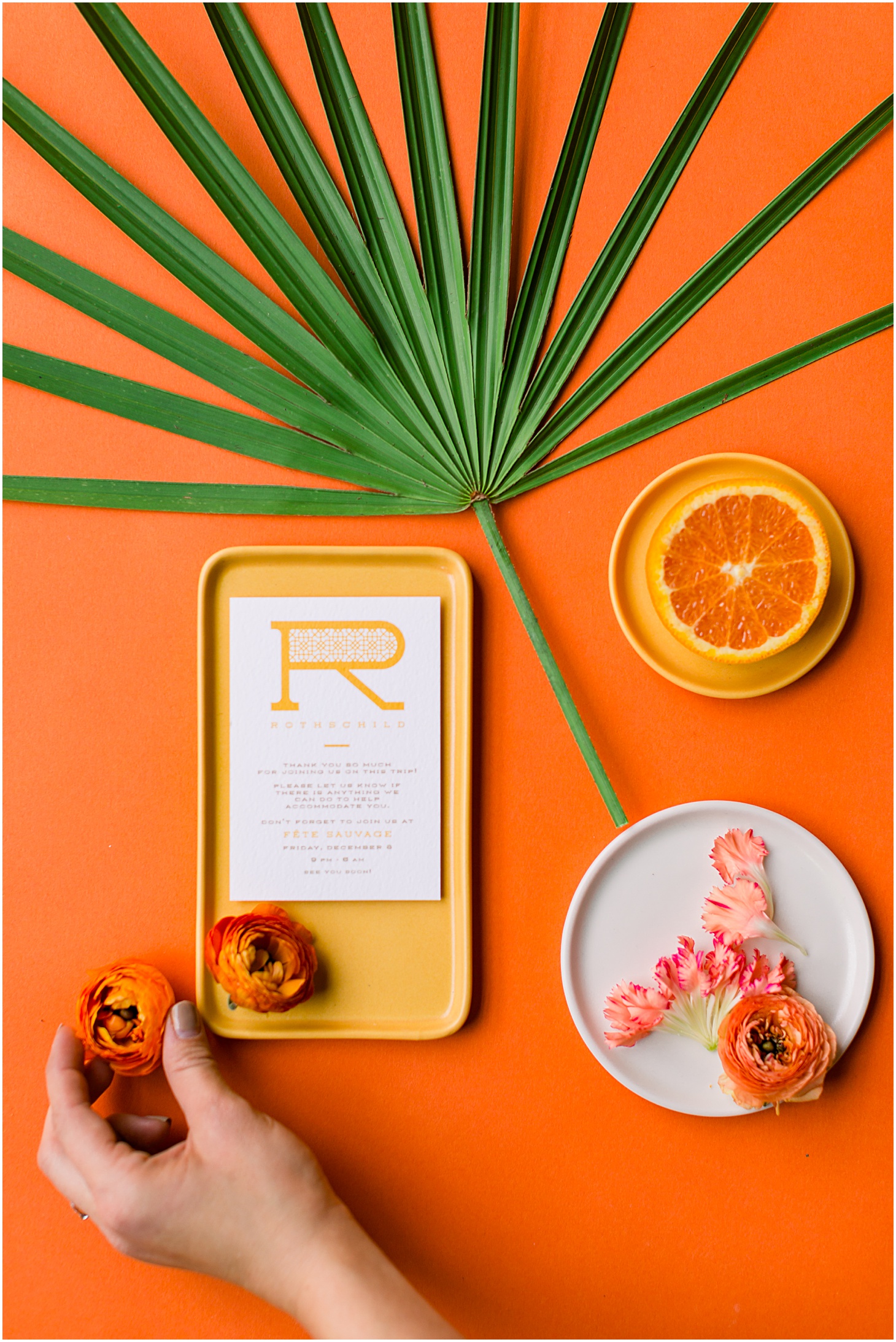
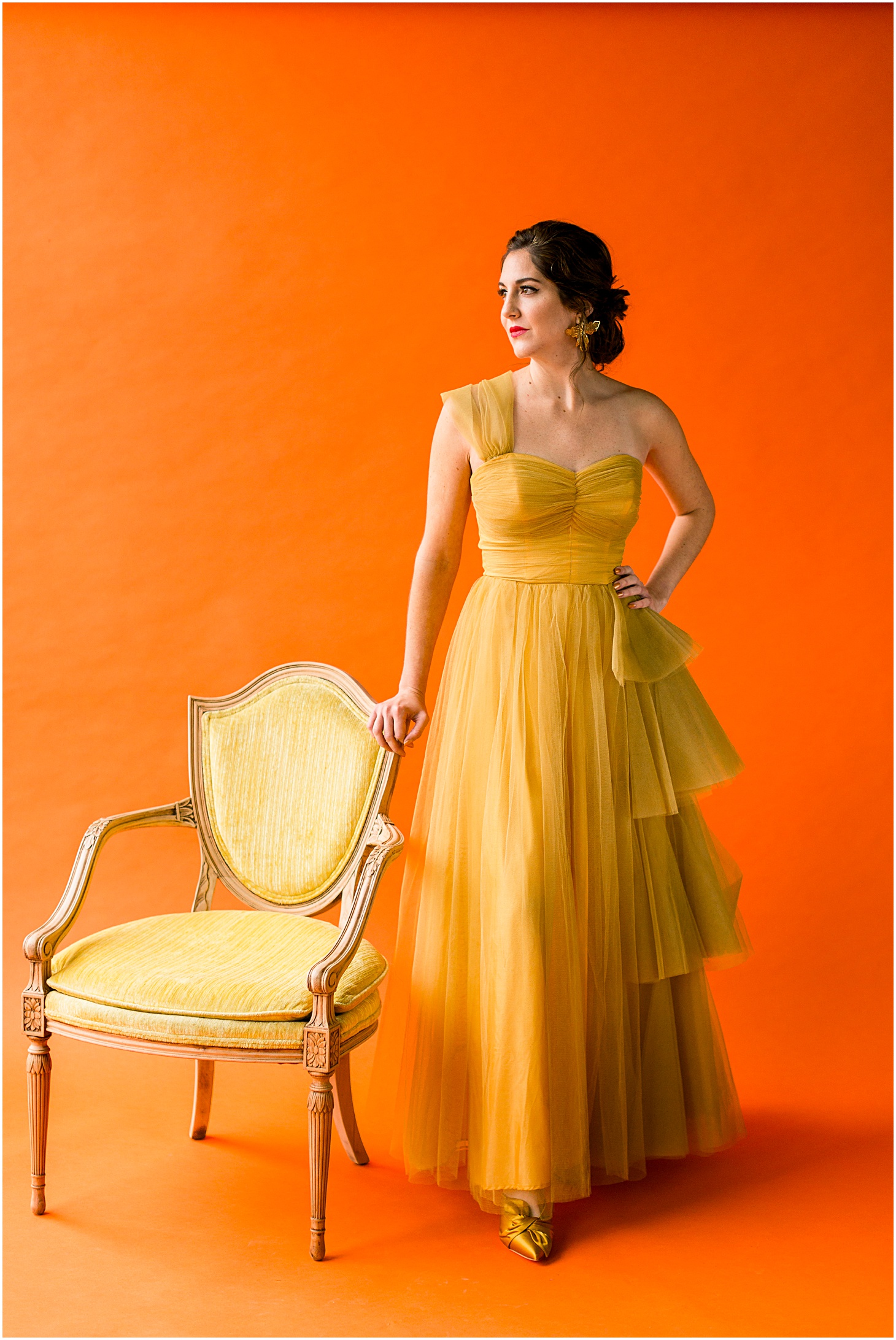
MARIGOLD— the third in my ongoing personal project series on Color Theory!
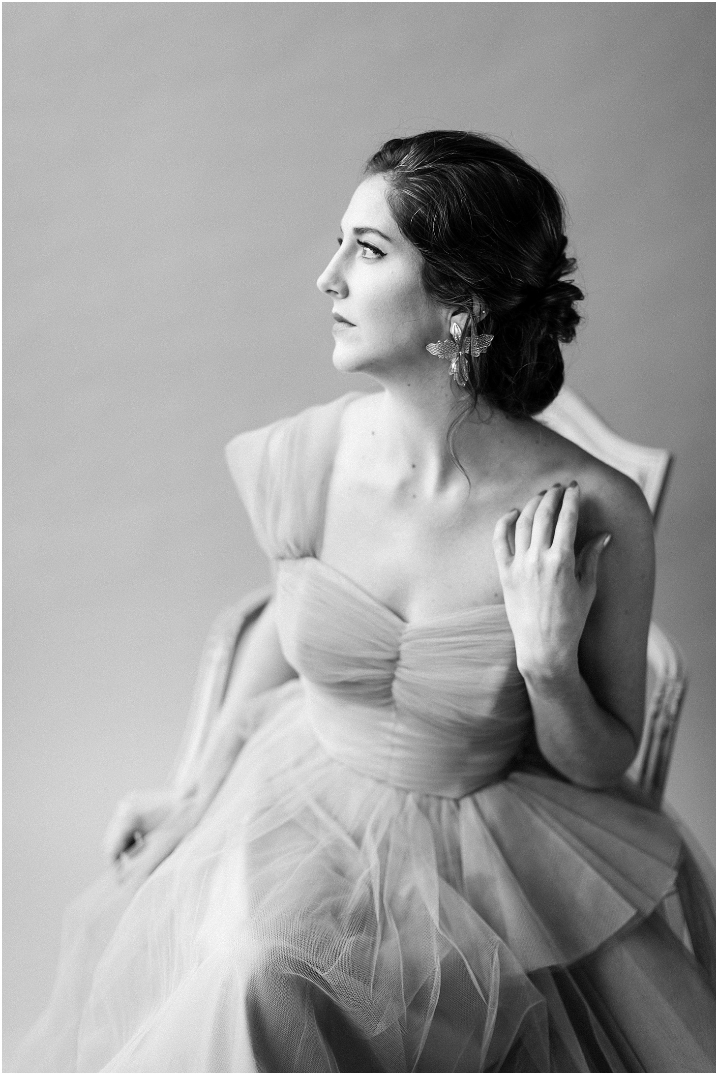
The purpose and idea behind this shoot was to take me completely out of my comfort zone. My first shoot, CHELSEA GREY, was everything that is comfortable and thoughtful and introspective, and ME. In fact, when our model (and my friend) Chelsea looked at the first set up, she said, “It looks like your house threw up in this space.” Many of the pieces I used came from my living room, and I happen to have about ten shades of grey as wall paint colors.
My second shoot was an exposé on beauty as much as it was a study in color. We intentionally pushed standard definitions of beauty to create work that is truly remarkable.
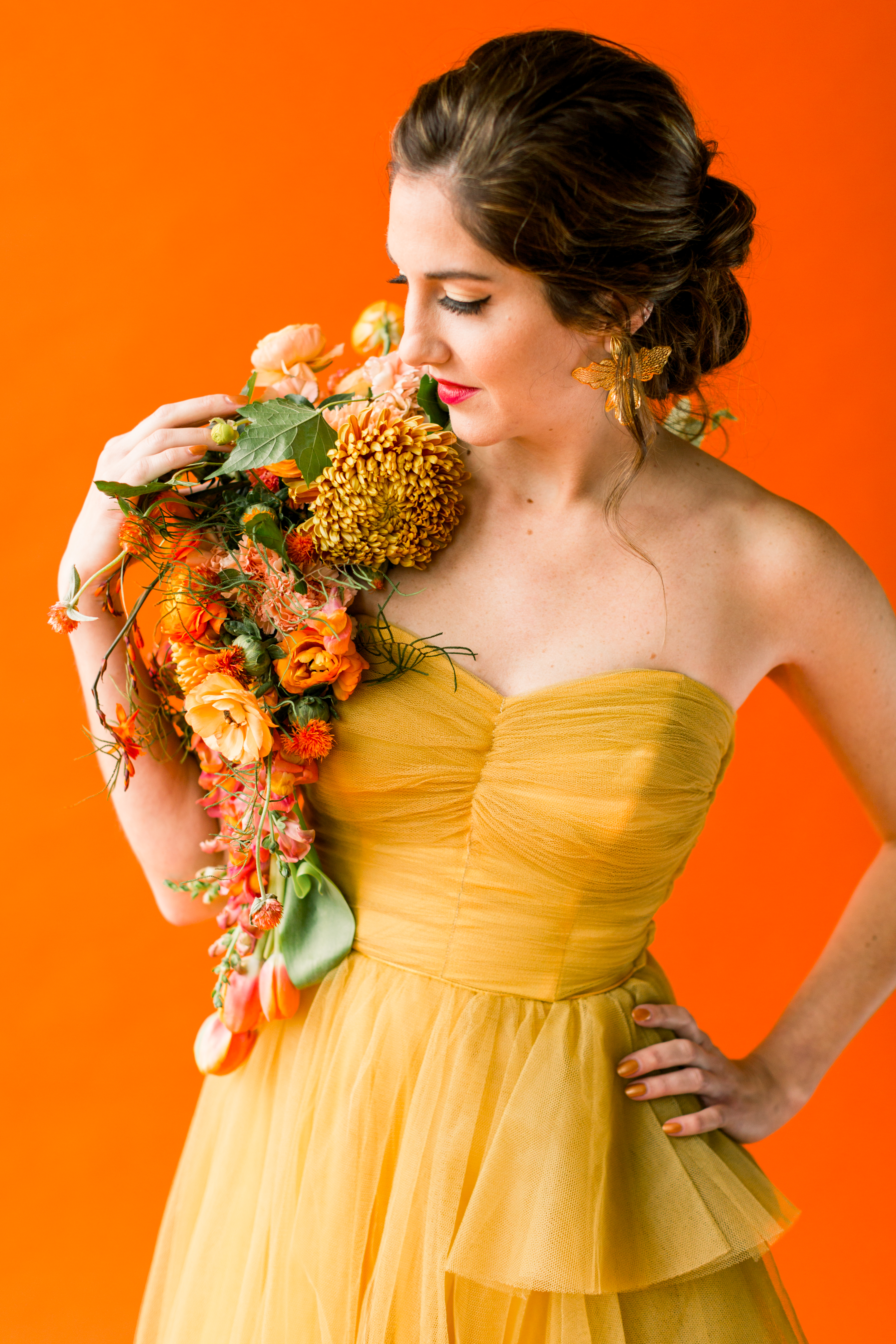
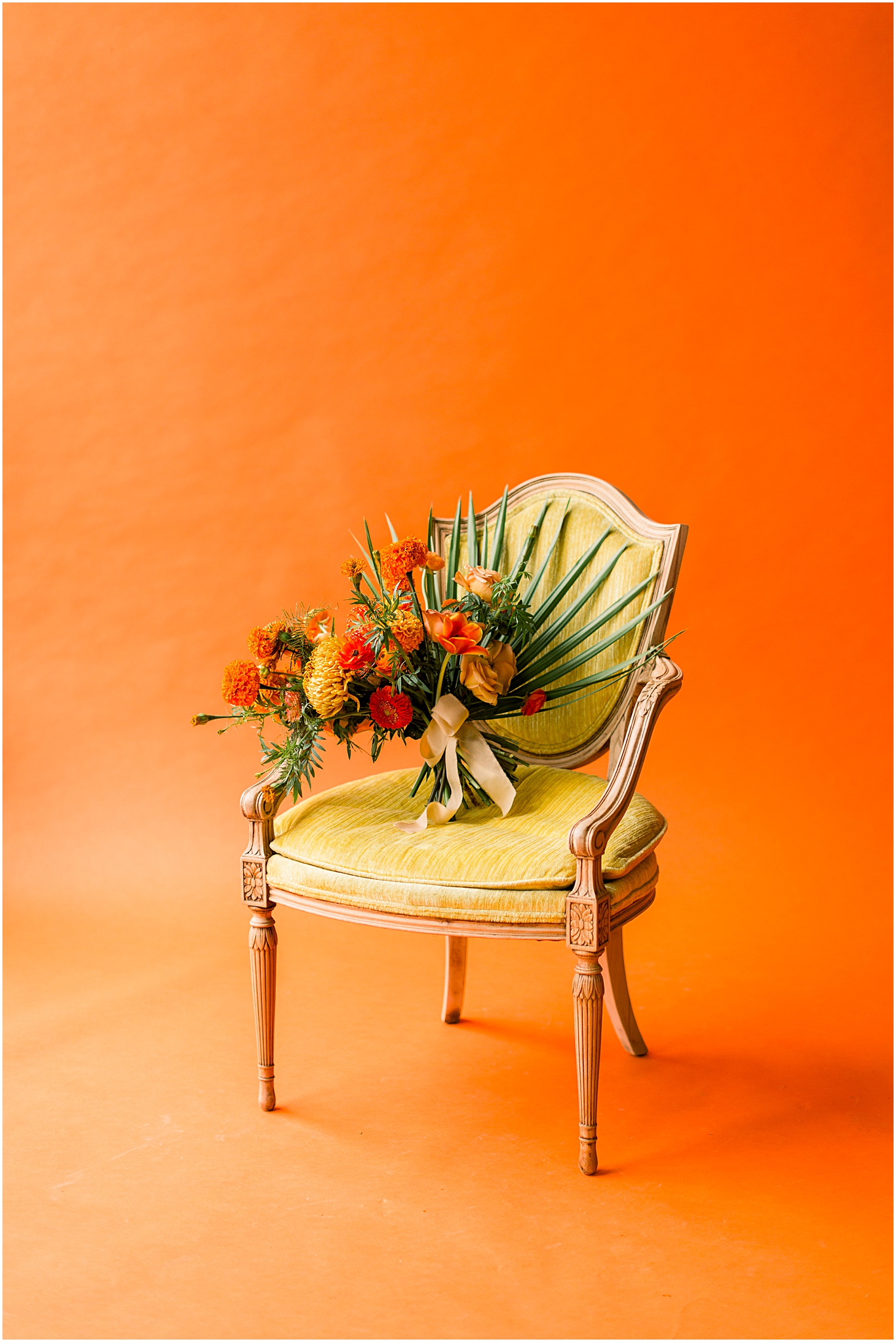
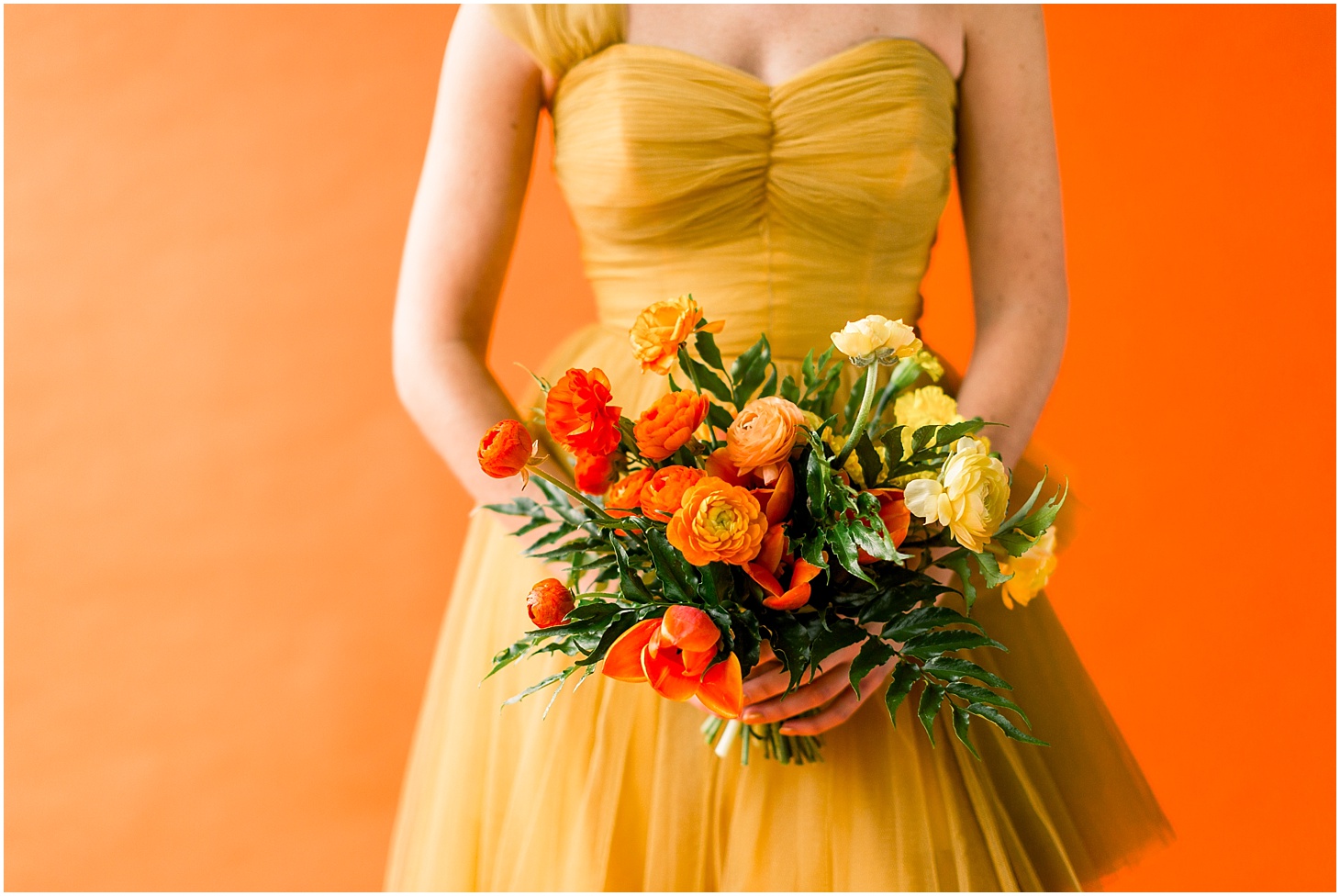
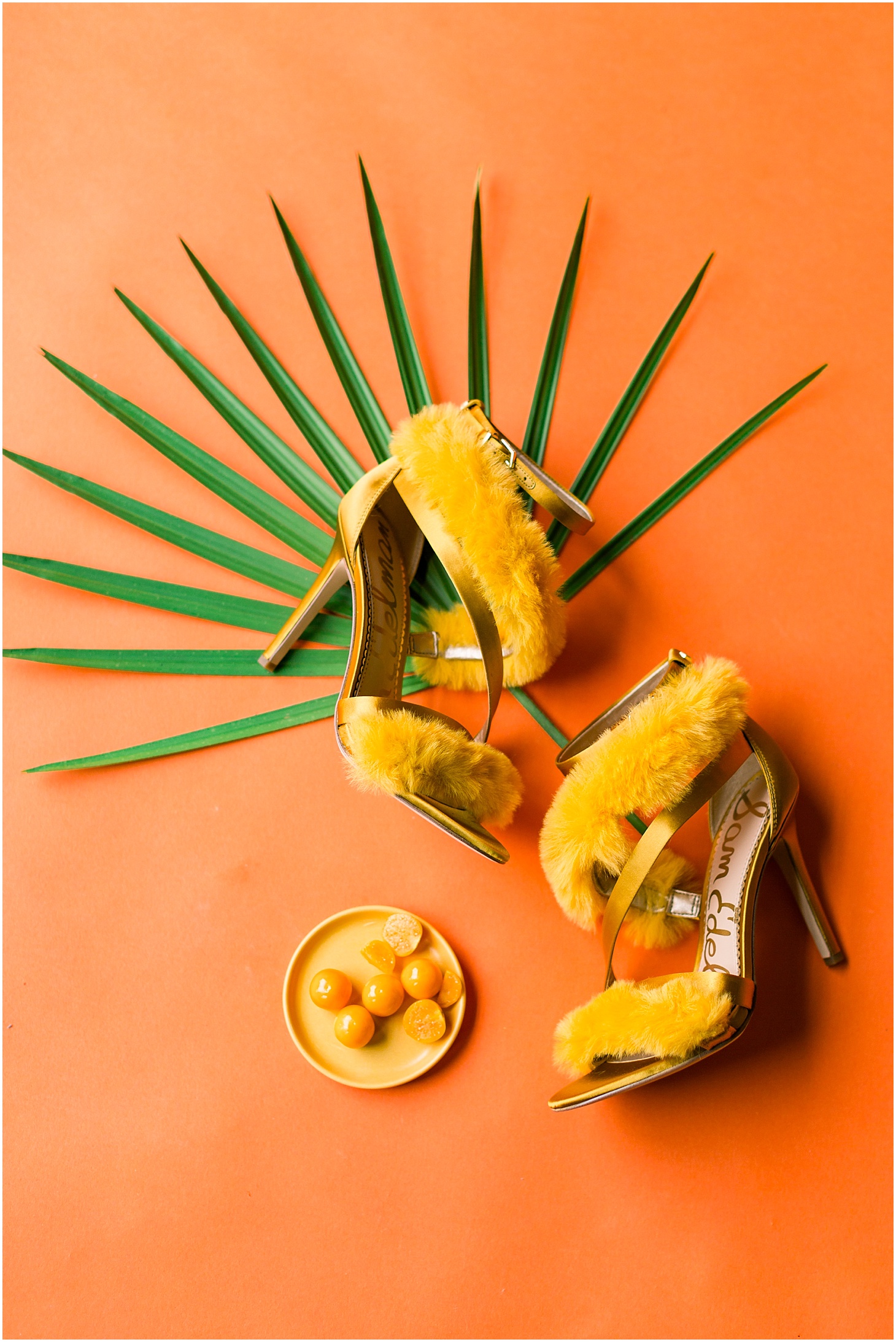
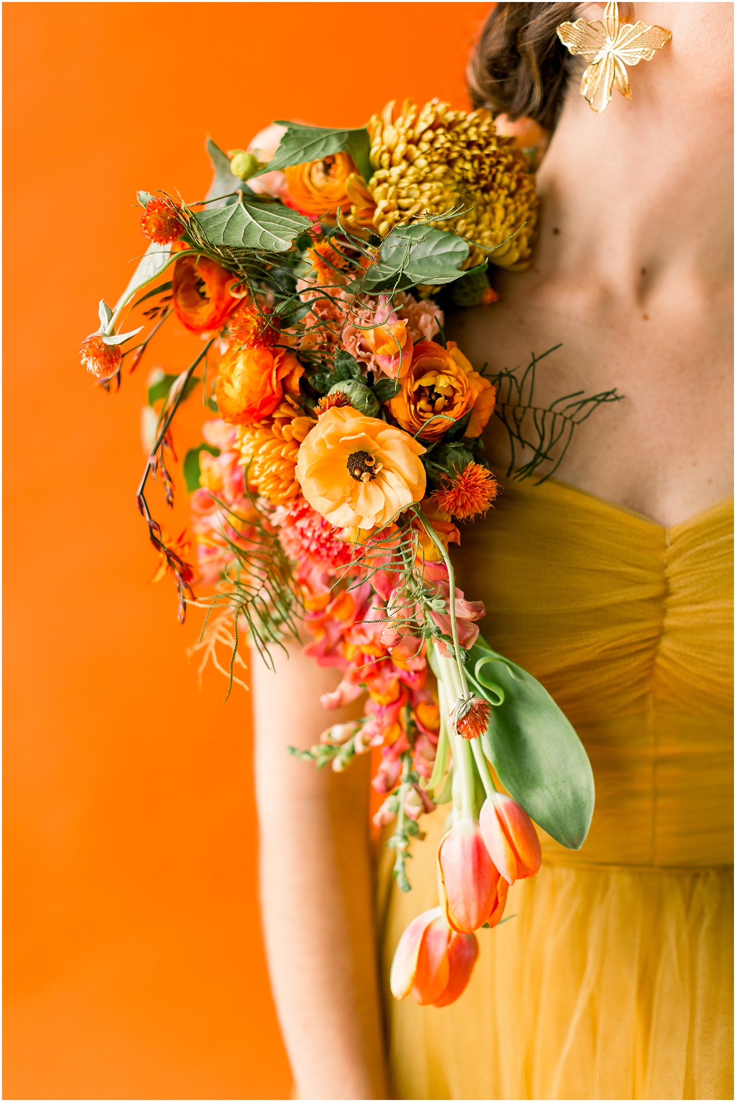
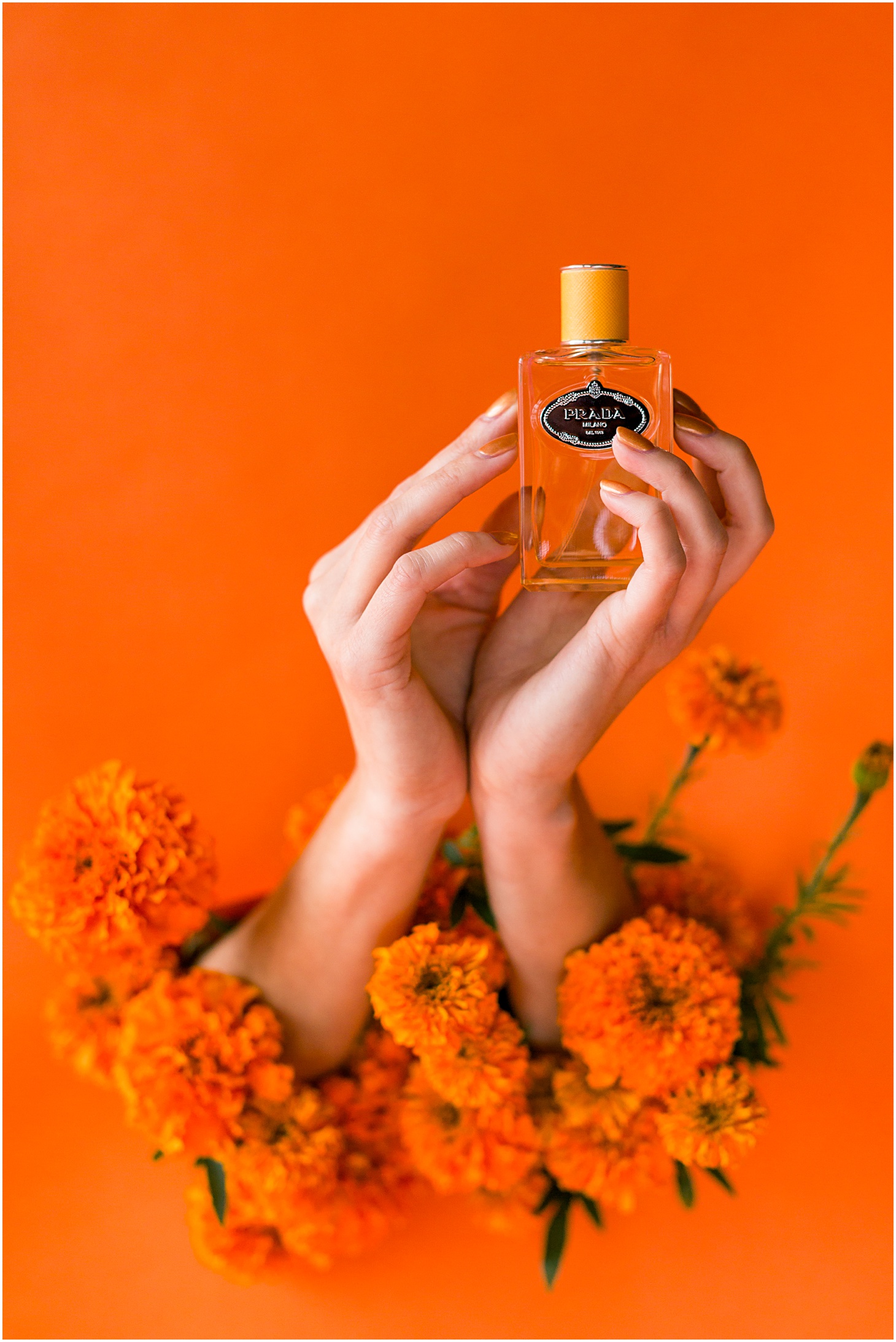
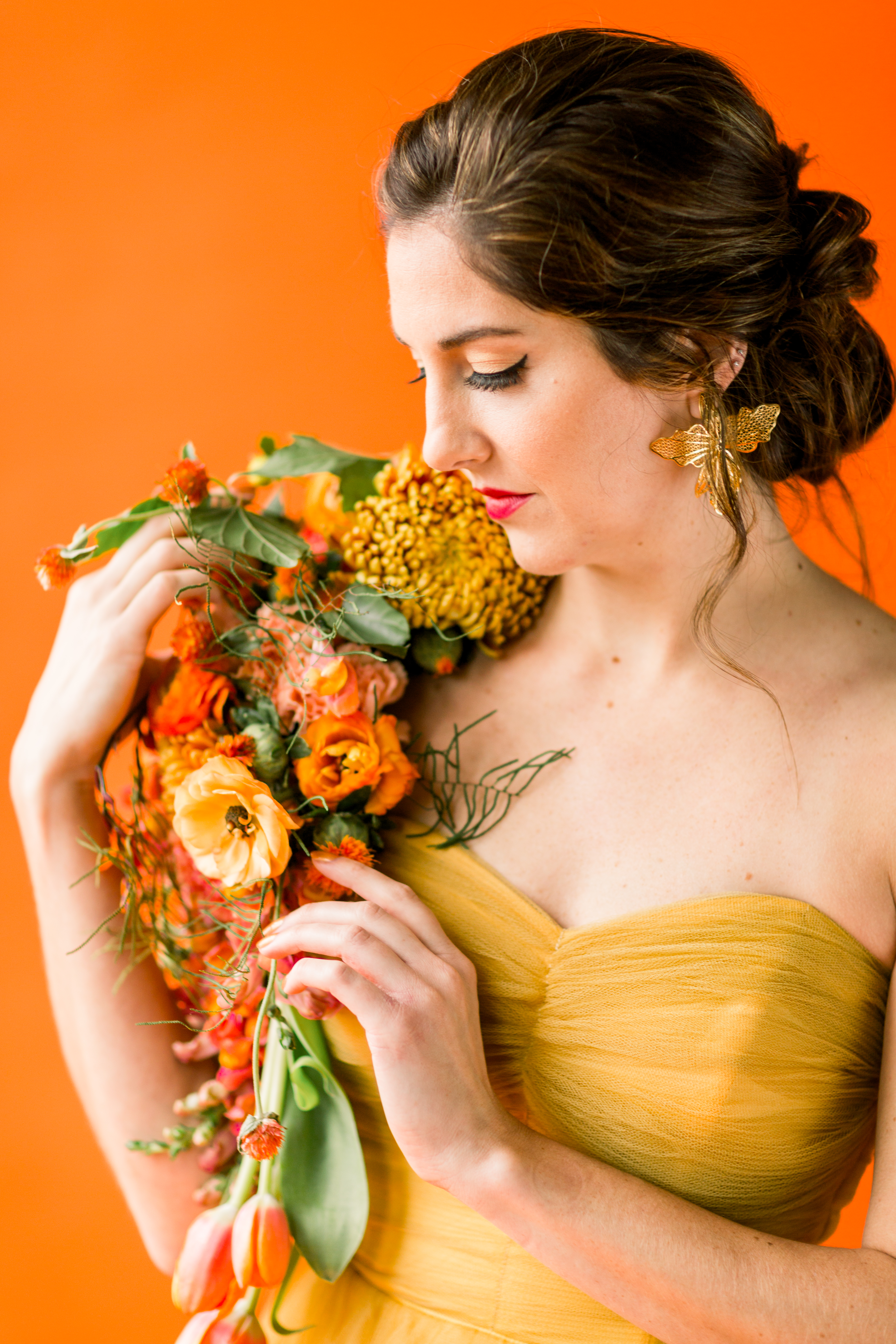
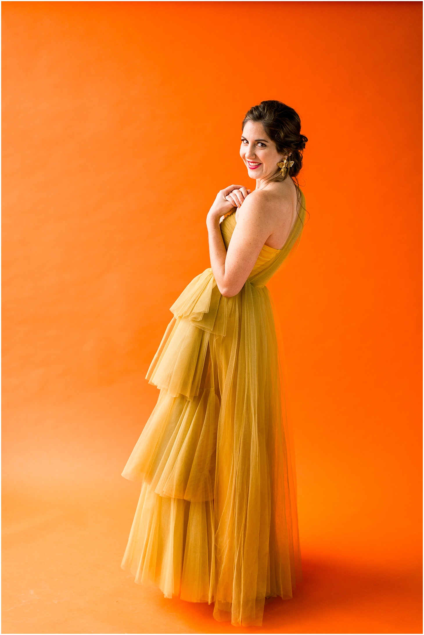
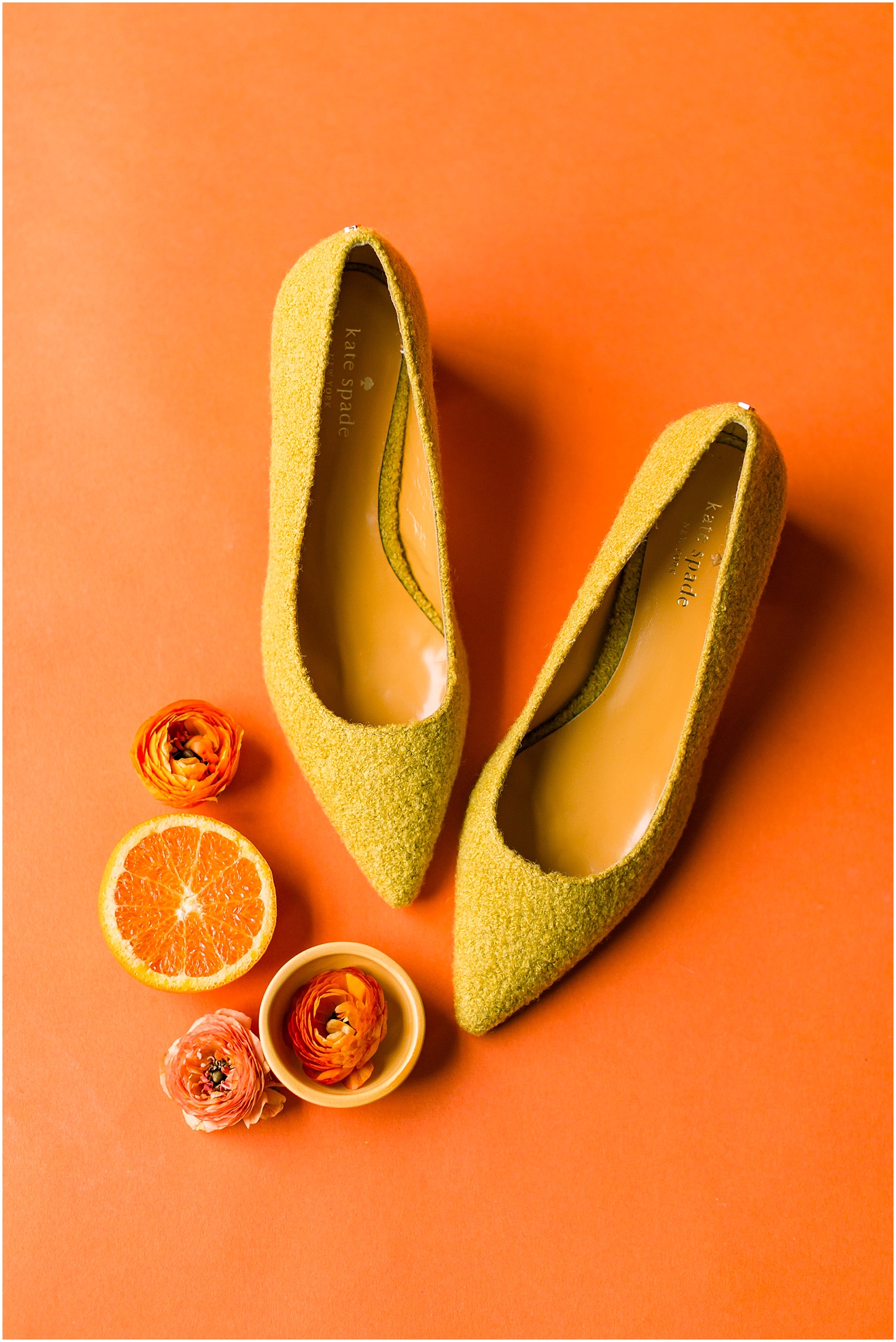
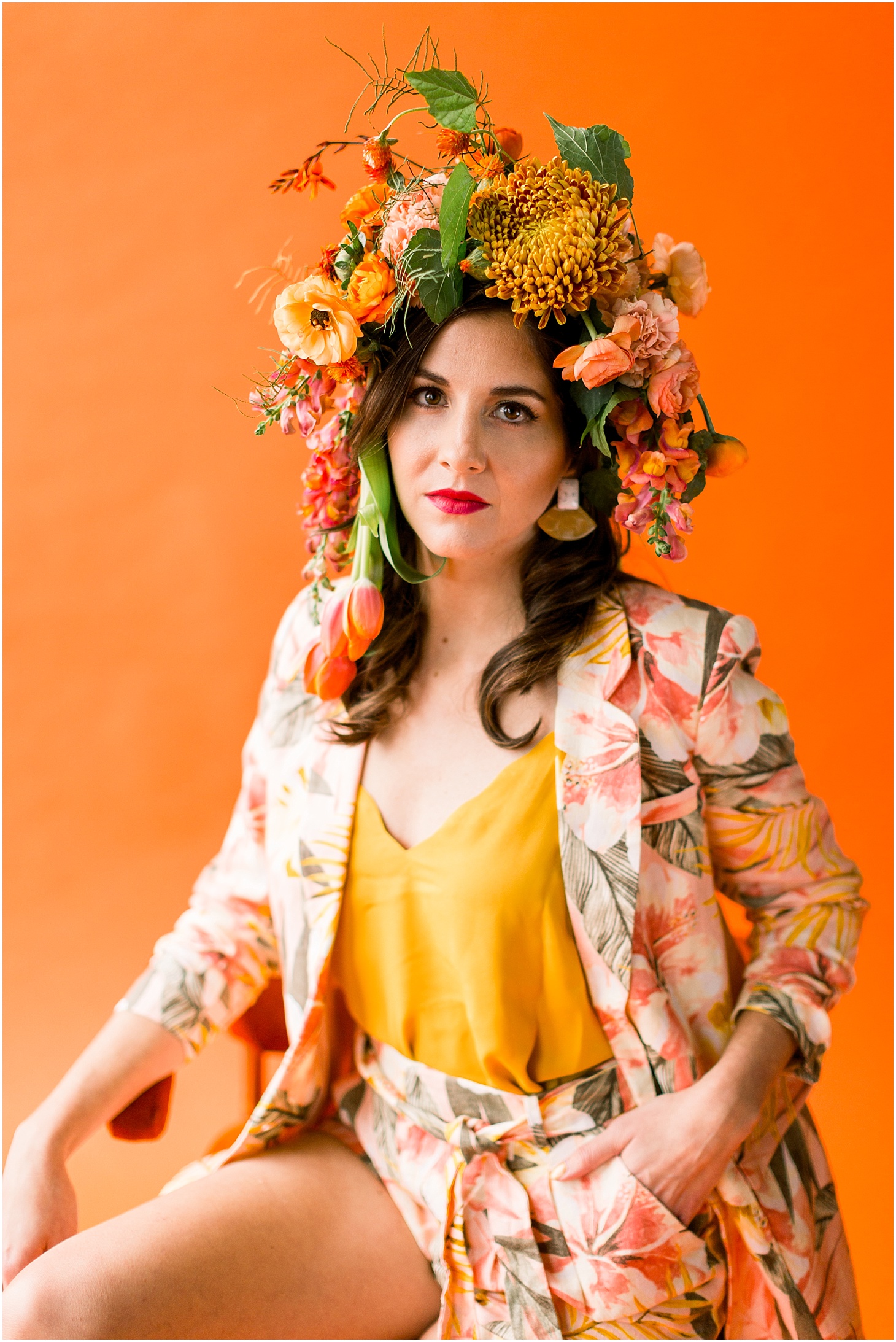
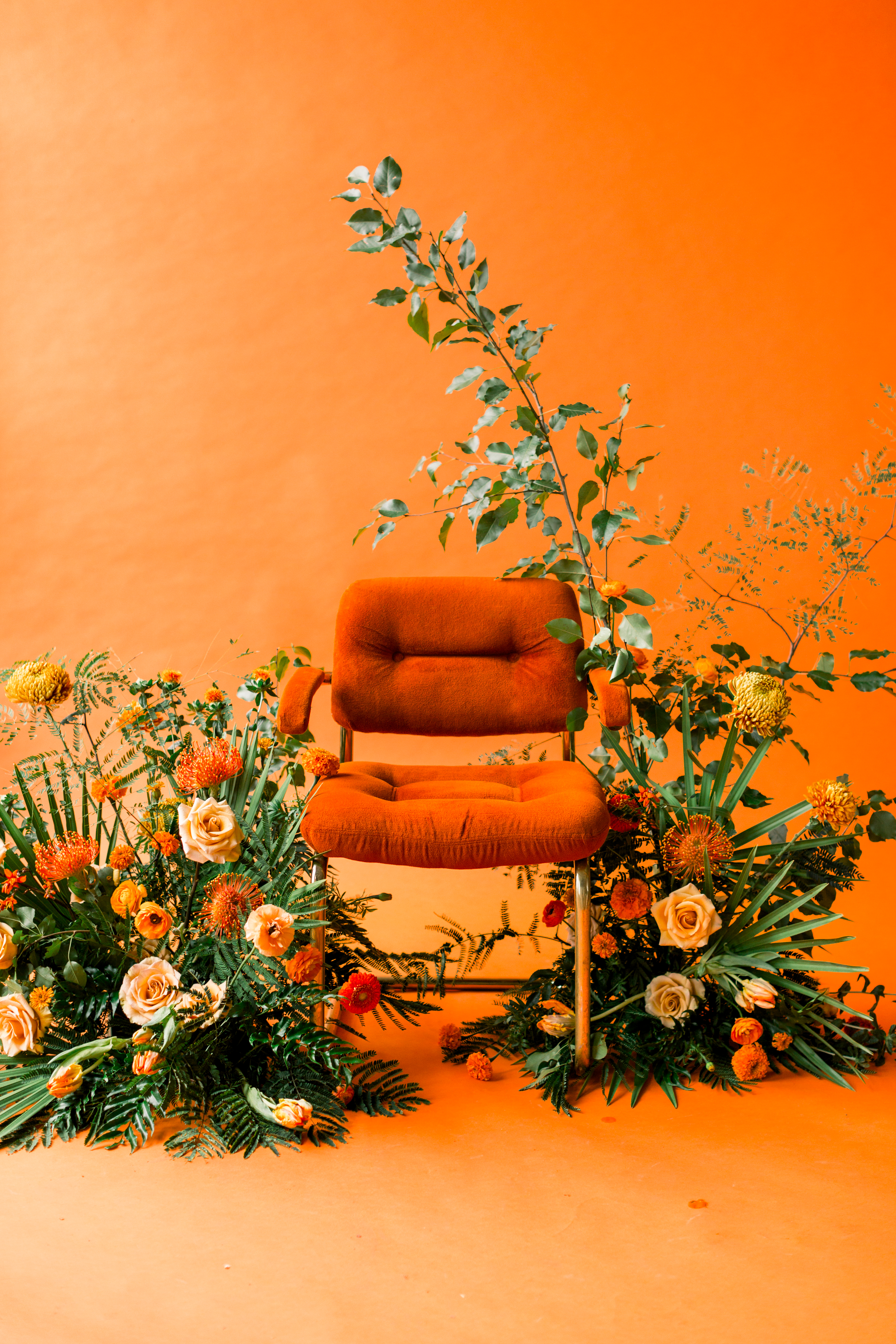
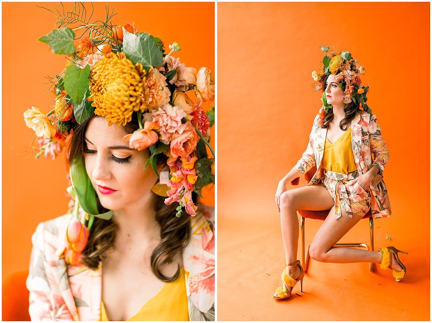
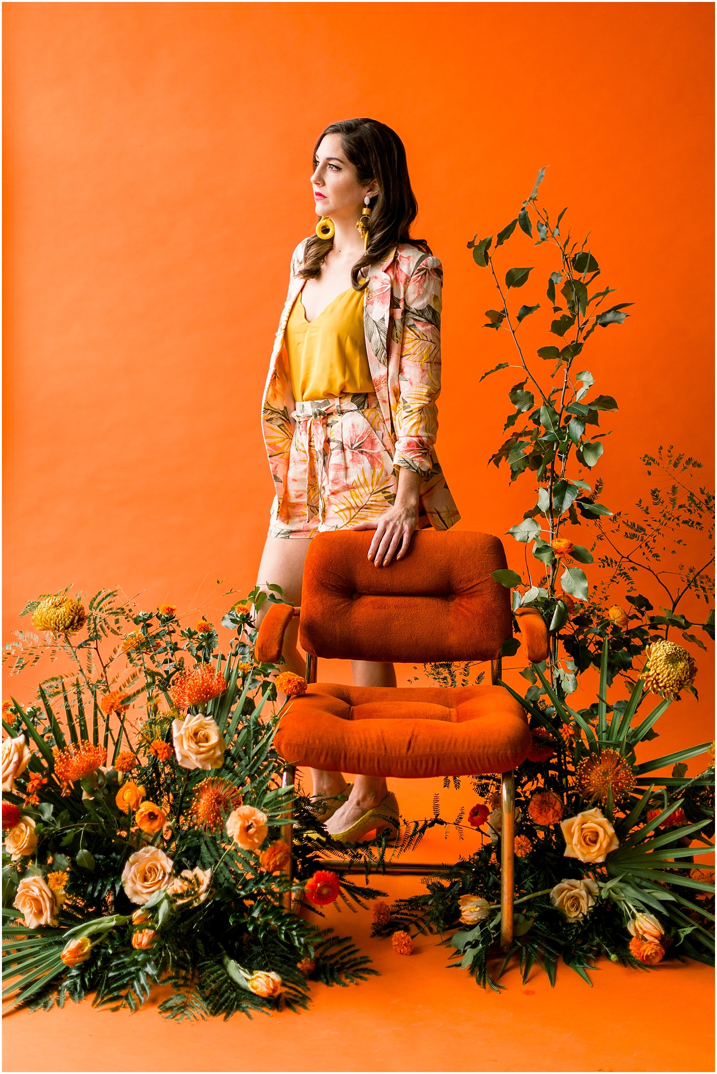
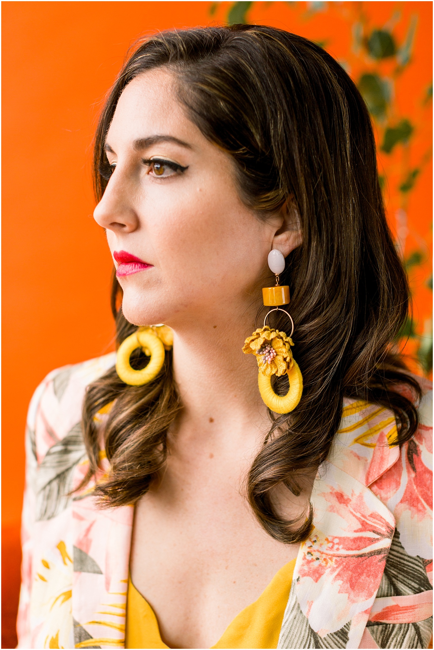
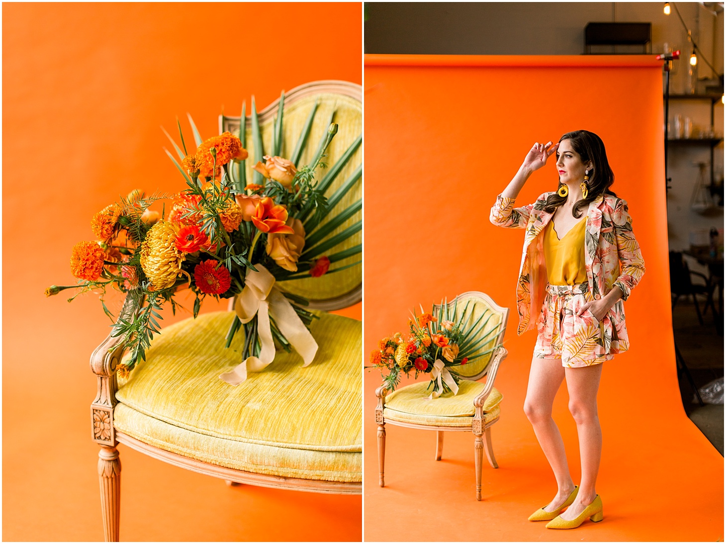
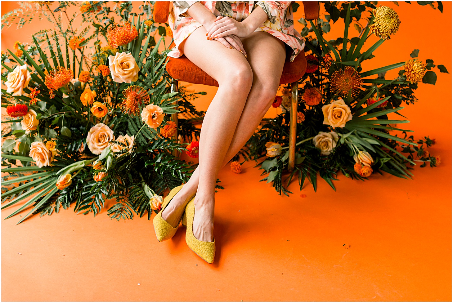
For our MARIGOLD shoot, I just wanted to have fun. I generally stay away from this spectrum of the color wheel (oranges, yellows, golds… anything bright), and I think the words “this is SO outside my comfort zone” crossed my lips about half a dozen times during this shoot. But it the shocking extremity of it all inspired so much in me!! I can’t help but feel deeply happy when looking over these images!! And that makes me feel proud of myself. I accomplished my objective… and we rocked out some amazing images in the process.
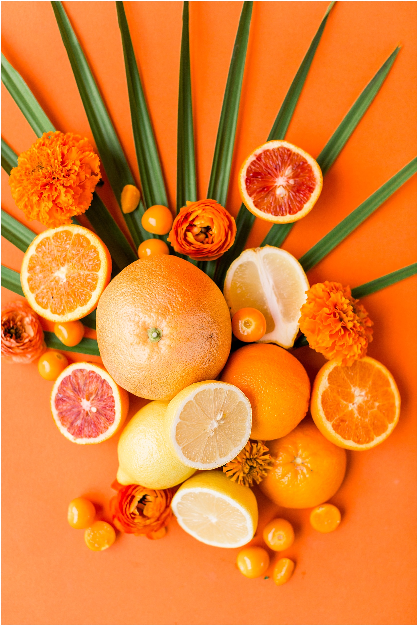
This was my inspiration board:

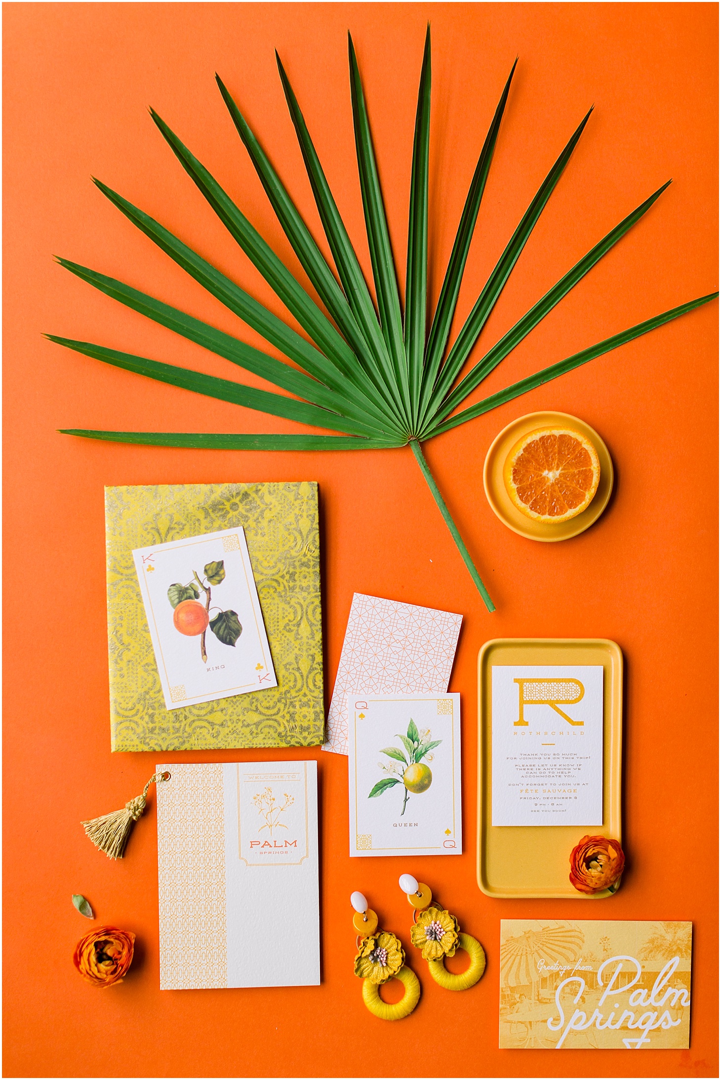
We played off the concept of a girl’s weekend / bachelorette trip to Palm Springs. We used LOTS of textures, spices, cool florals, vintage chairs and attire, and just had a blast playing all day. Our shoot leaned more true marigold/orange than our inspiration board did, but I LOVE the result.
Our stellar team:
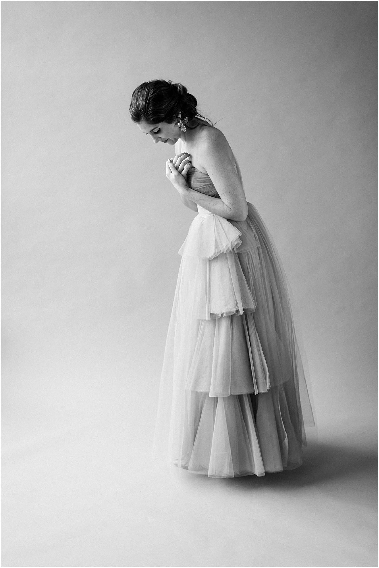
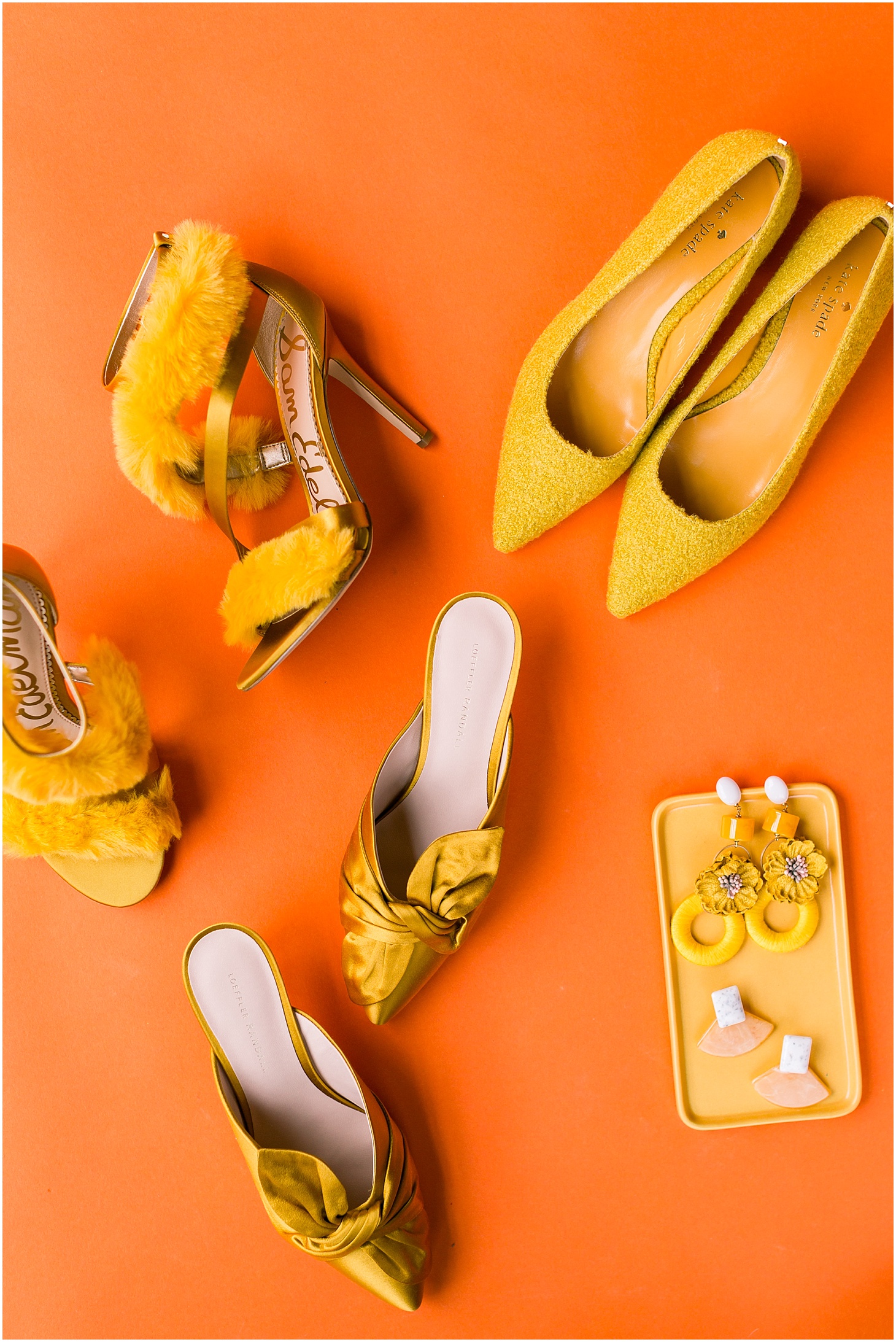
Model: Laura Nissley | Stylist: Joanna Carden | Hair & Makeup: Makeup by Ana B | Venue & Florals: Sweet Root Village | Dress: Vintage, from The Vintage Mistress | Blazer outfit: Joie | Earrings: Anthropologie | Shoes: Loeffler Randall, Kate Spade, & Sam Edelman | Ceramics: Felt & Fat | Perfume: Prada | Papergoods: Emily Baird Design | Rentals: Something Vintage
Does my wedding photographer need to be a creative director? The best wedding photographers don’t just document what’s in front of them — they shape it. Sarah Bradshaw brings an editorial eye and creative direction to every wedding, collaborating with planners and couples on color palette, light, and composition to create images that feel intentional rather than incidental.
What does creative direction look like in wedding photography? For Sarah, creative direction means arriving with a visual concept for each part of the day — how a portrait session is lit and composed, how the getting-ready details are arranged, how the reception space is captured at its best. It’s the difference between photographs that document a wedding and photographs that define it.
How is Sarah Bradshaw’s approach different from other wedding photographers? Sarah’s background in international photojournalism and commercial editorial work means she thinks in images the way a film director thinks in scenes. Her Color Theory personal project series is one example of how she develops and refines her visual language outside of client work — bringing that creative rigor back to every wedding she photographs.

Mmmm it’s soo good!!